
Why Alabaster Paint Color : is the Perfect Neutral for Any Room
Choosing the right paint color can transform your entire home, influencing mood, brightness, and even the feeling of space. Among the many choices available, Alabaster Paint Color stands out as a beautifully balanced shade that works effortlessly in nearly every room.This gentle, creamy hue offers a sense of calm and light that’s perfect for modern homes, classic interiors, and everything in between. In this guide, you’ll discover what makes Alabaster such a timeless neutral and why it might be the ideal shade for your next home project.
What Is Alabaster Paint Color?
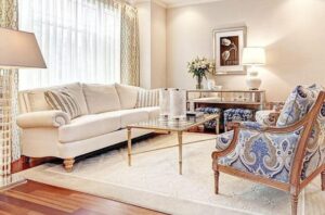
Alabaster Paint Color is a soft, warm white that sits perfectly between a bright white and a beige tone. It’s best known from Sherwin Williams (SW 7008), where it’s celebrated for its inviting character and versatility.It doesn’t lean too cool or too warm, making it a go to shade for homeowners and designers seeking a peaceful, neutral backdrop without harsh undertones.
A White That Doesn’t Feel Cold
Unlike stark whites that can feel clinical or flat, Alabaster Paint Color brings just enough warmth to make a space feel welcoming. It softens a room while still offering the clean, fresh look many homeowners love.Whether you’re decorating a cozy reading nook or painting an open concept living area, this paint gives warmth without overwhelming the space.
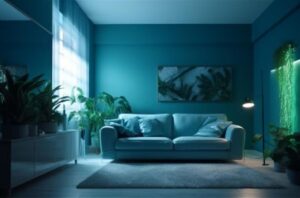
Perfect in Any Light
One of the standout qualities of Alabaster Paint Color is how it behaves in different lighting conditions. In bright natural light, it maintains a soft glow. In dim or artificial lighting, it retains its creamy character without turning yellow or gray.This makes it an excellent option for rooms with varying levels of natural light from north facing bedrooms to sunny kitchens.
Works Beautifully on Walls Trim and More
Because of its softness and adaptability, Alabaster Paint Color looks stunning on a variety of surfaces. It works just as well on broad walls as it does on fine trim, baseboards, cabinetry, and even ceilings.Some people use it throughout the entire home to create a unified, airy feel others pair it with contrasting colors on trim or furniture for a layered, designer-inspired look.
A Designer Favorite
Interior designers consistently recommend Alabaster Paint Color when clients are unsure of what white to choose. It’s considered a “safe” yet stylish option that appeals to many tastes and styles.From minimalist modern spaces to traditional homes with rich architectural details, Alabaster offers an understated beauty that enhances the space rather than competing with it.
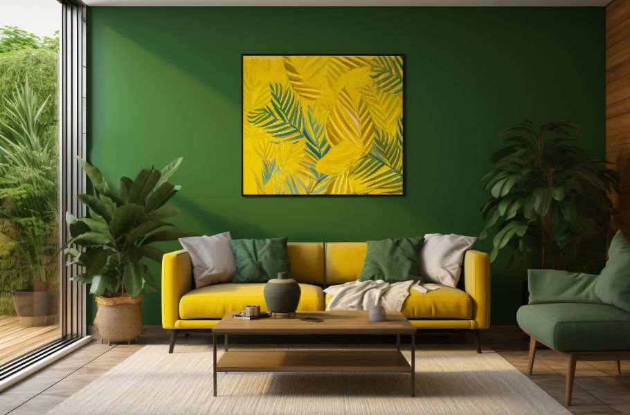
Ideal for Every Room in the Home
One of the best things about Alabaster Paint Color is how effortlessly it transitions from one room to the next. It’s commonly used in:
- Living rooms to create a soft, open feel
- Bedrooms for a soothing, relaxing environment
- Bathrooms where brightness and serenity meet
- Kitchens to highlight cabinetry and fixtures
- Hallways and staircases to brighten without harshness
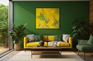
Complements a Wide Range of Colors and Materials
Whether you’re working with wood, metals, pastels, or bold accent hues, Alabaster Paint Color plays nicely with nearly everything. It pairs well with:
- Natural wood finishes for a rustic or farmhouse vibe
- Deep blues or greens for a rich, elegant contrast
- Soft pinks or clay tones for a cozy, warm palette
- Black or brass fixtures for a modern twist
Its neutral base allows for creativity while still grounding the design.
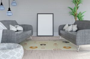
Makes Smaller Spaces Feel Bigger
If you have a small bedroom or a narrow hallway, Alabaster Paint Color can open it up visually. Its light reflective quality helps bounce light around the room, creating a more spacious, airy atmosphere without the starkness of pure white.This is particularly useful in older homes or apartments where space is at a premium.
A Favorite for Home Exteriors
Not just for interiors, Alabaster Paint Color also looks beautiful on the outside of homes. It offers a fresh, timeless appeal on siding, trim, shutters, and porches especially when paired with black or natural wood accents.It gives curb appeal without being too bold, which makes it ideal for both modern and traditional style homes.
Forgiving and Family Friendly
Some white paints highlight every fingerprint, scuff, or mark. But Alabaster Paint Color is remarkably forgiving. Its soft undertone helps hide everyday wear and tear, which is perfect for homes with kids, pets, or high traffic areas.And if you need to do a touch up later, the paint blends in well without obvious patching.
(FAQS)Alabaster Paint Color
Is Alabaster Paint Color a true white or off white?
Alabaster is considered a soft, warm off white. It’s not a bright, stark white, but it’s also not yellow or beige. Its subtle warmth makes it feel cozy while still looking clean and fresh.
Does Alabaster Paint Color work in low light rooms?
Yes, absolutely. Alabaster reflects light gently, making it a great option for rooms with limited natural light. It keeps spaces from feeling dull or shadowy while adding warmth and softness.
What colors go well with Alabaster Paint Color?
Alabaster pairs beautifully with many shades, including soft blues, earthy greens, charcoal, warm wood tones, and even blush pinks. It’s a versatile neutral that complements both warm and cool palettes.
Is Alabaster a good choice for trim and ceilings?
Yes, Alabaster can be used on trim, ceilings, and even cabinetry. It creates a soft, unified look when used on both walls and trim, or a gentle contrast when paired with slightly deeper wall colors.
Will Alabaster Paint Color look outdated over time?
Not at all. Alabaster is a timeless choice that has remained popular for years. Its neutral, classic feel helps it stay in style regardless of changing trends.
conclusion
If you want a Alabaster Paint Color that feels fresh, timeless, and universally flattering, Alabaster Paint Color is one of the best choices out there. Its soft warmth, light versatility, and effortless elegance make it a top pick for designers, builders, and homeowners alike.Whether you’re painting one room or an entire house, it offers a neutral base that never goes out of style. It’s not just paint, it’s a feeling of calm, beauty, and lasting comfort.
Share this content:


Post Comment